
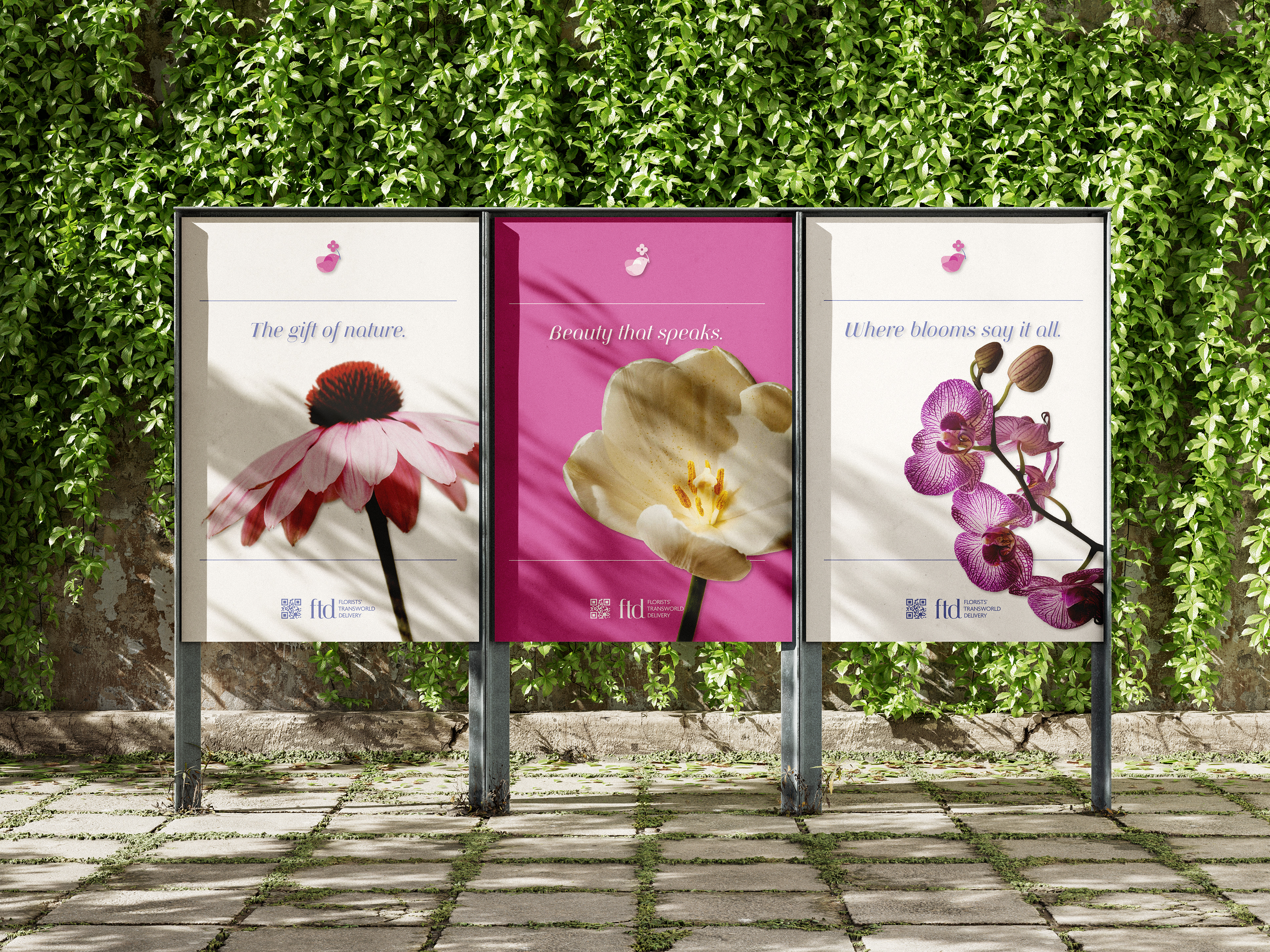
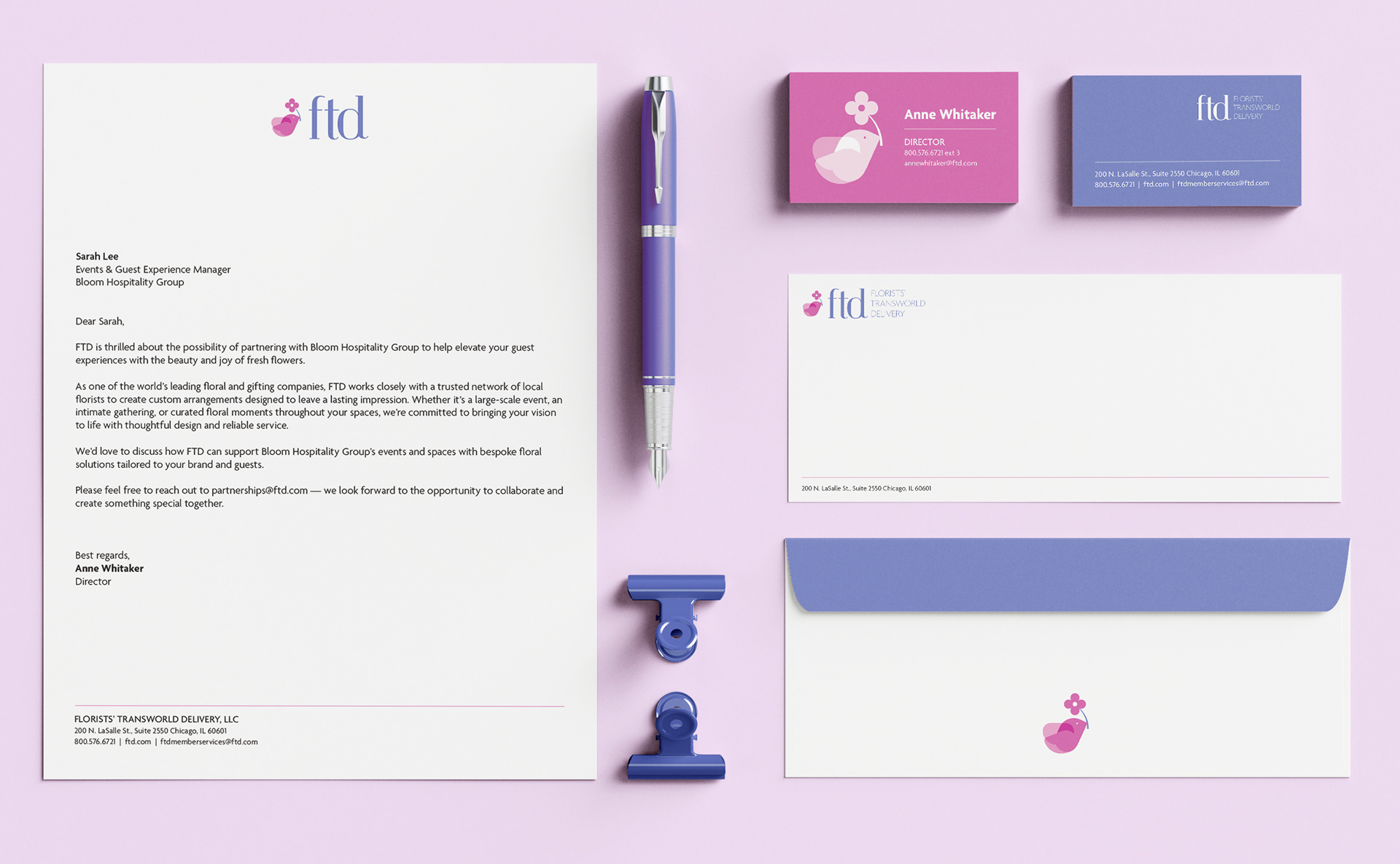
FTD is one of the world’s largest florist networks, delivering handcrafted bouquets through 30,000 shops in over 125 countries. While rooted in tradition, their brand needed a more modern, approachable look.
To modernize FTD’s identity while honoring its heritage, I reimagined the logo with a clean sans-serif typeface and a simplified symbol: a bird carrying a flower. This shift moves away from the more aggressive, mythological tone of the original Mercury Man, instead suggesting speed and reliability in a softer, more approachable way. The result is a contemporary mark that still communicates fast delivery, while feeling more relevant and inviting to today’s audience

BEFORE

AFTER


___________________________________________________________________
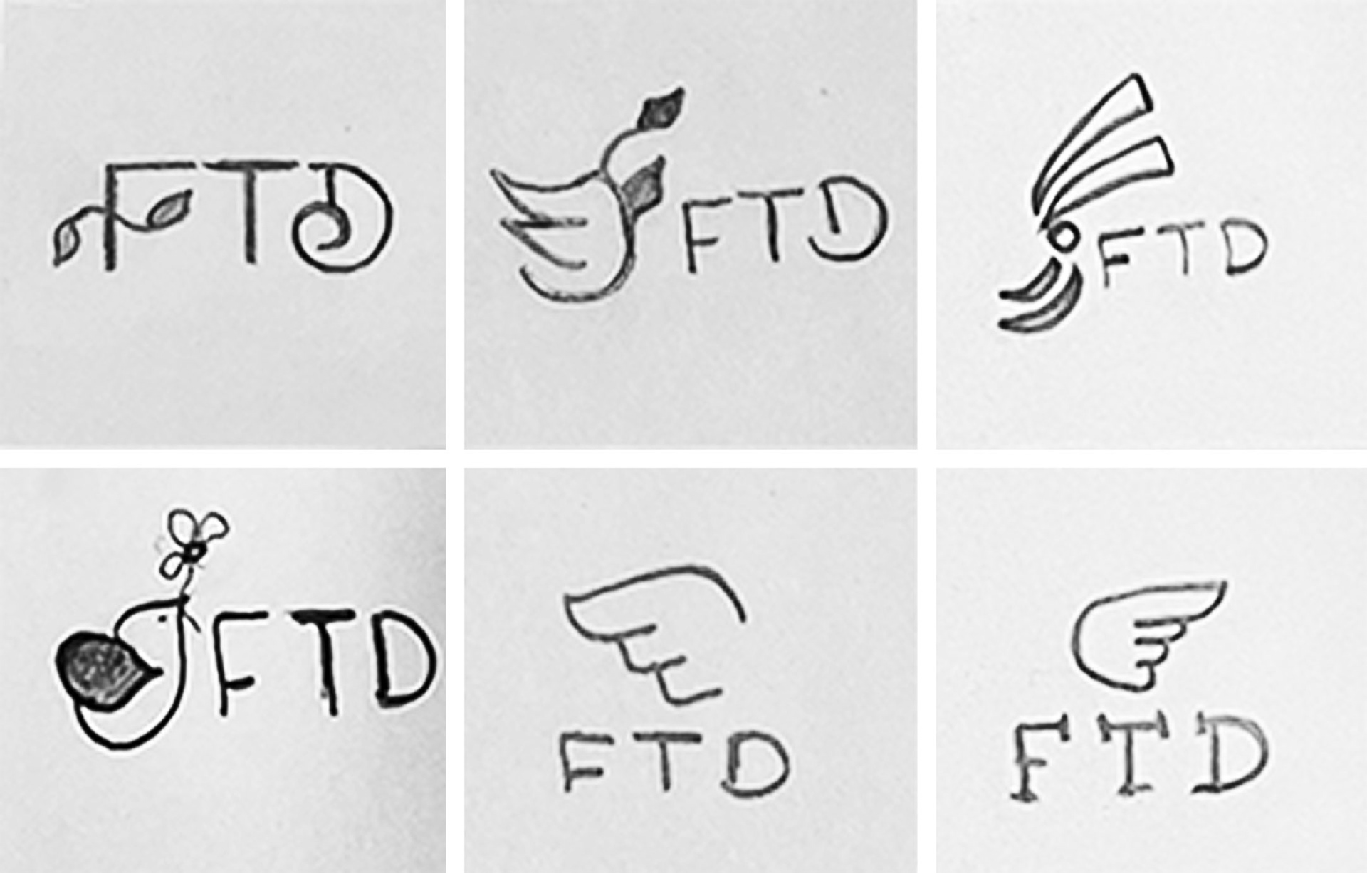
DESIGN PROCESS
sketches
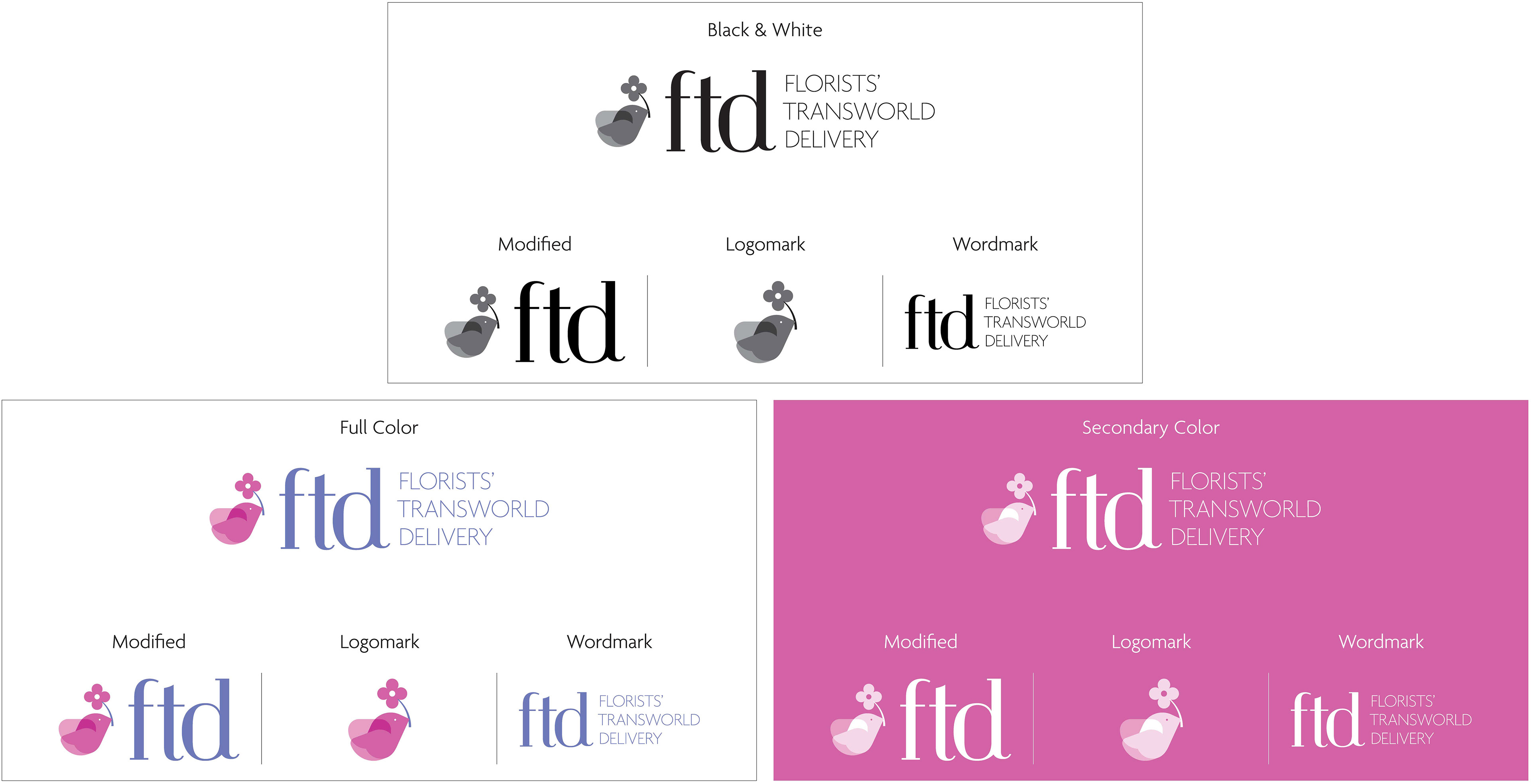
LOGO VARIATIONS
LOGO EXCLUSION ZONE
To ensure visual clarity and maintain a clean appearance, keep clear space around the logo equal to the height of the flower.

COLOR PALETTE

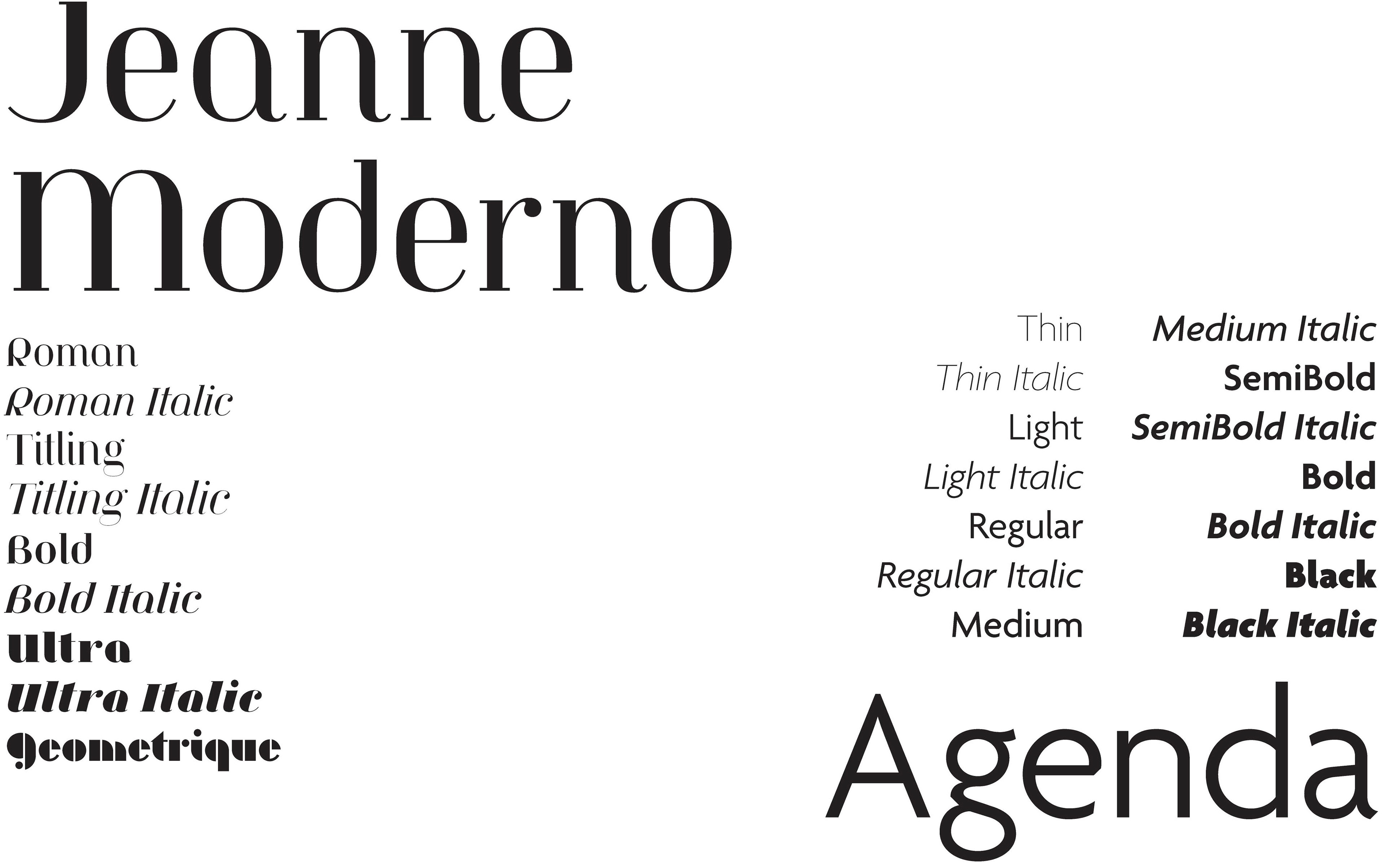
TYPOGRAPHY
___________________________________________________________________